If your team is using Microsoft Dynamics 365, there are some powerful data analytics capabilities at your disposal. If you add Power BI from The Power Platform, there are even more possibilities for helping your key team members see exactly what they need to about your customers. Which one is better, though? We decided to conduct a Power BI vs Dashboards showdown at Cobalt to highlight the most important differences so you can make a choice between them with confidence.
What is Power BI?
Power BI is the data analytics arm of The Power Platform — Microsoft’s solution for creating low code/no code business applications. Power BI allows business users to create their own interactive dashboards that include advanced business intelligence reporting capabilities.
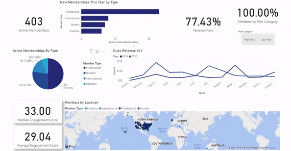
Cobalt’s Power BI dashboards are where associations can find data like member renewal rate, average member engagement score, and so much more. Like D365 dashboards, we’ve configured a handful of Power BI dashboards to fit the core needs of associations, but these can easily be configured to fit your objectives.
At the risk of oversimplifying, associations can think of Power BI dashboards as the more advanced, more powerful version of Dynamics 365 dashboards. They can do more, but they are also a little more complicated. We typically recommend using Power BI dashboards for communicating information to executives.
What are Dynamics 365 Dashboards?
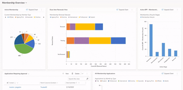
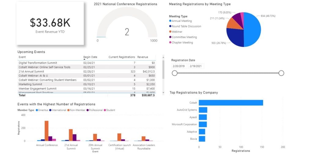
Cobalt’s association management software (AMS) is built on top of Microsoft Dynamics 365. Dynamics includes the ability to configure visuals that can be embedded into a dashboard. Cobalt has taken the time to configure D365 dashboards to fit the needs of associations. Out of the box, these dashboards use easy-to-read visuals to show information like memberships by member type, dues by renewal status, and membership applications that need approval.
These dashboards can be easily configured to show different visuals when needed. They are also persona-based, meaning that each time a staff member logs into the system, they see a dashboard most relevant to their day-to-day role. For example, your membership staff may see total membership numbers, upcoming renewal data, or applications requiring review. Your events staff might see event revenue by meeting type or number of people registered for the annual meeting.
These dashboards are meant to act as a home base where staff can quickly see the KPIs and their “to do” list for the day.
Power BI vs Dashboards in Dynamics 365
So what is the difference between a Power BI and Dynamics 365 dashboard?
If you are new to Dynamics, you might not even be able to initially tell the difference between the two, especially because you can embed a Power BI dashboard within Dynamics, making both types of dashboards located in the same place.
Dynamics 365 (and the reporting functionality that comes with it) has been around a lot longer than Power BI. But, Power BI has a lot of reporting functionality that is not possible in Dynamics 365. Although Power BI has a lot of new, shiny features, that does not mean Power BI is meant to completely replace the Dynamics 365 dashboards that can be configured within the AMS.
Both reporting services are meant to provide organizations with business intelligence, but there are certain scenarios where one service is clearly superior to the other. Let’s take a look at a couple of different scenarios and see which service is most appropriate.
You want to do Excel-like calculations
One of the major benefits of Power BI is its ability to do Excel-like calculations based on data. Cobalt’s Membership Power BI dashboard uses this functionality in a couple of different places, but a great example of this is the Member Renewal Rate.
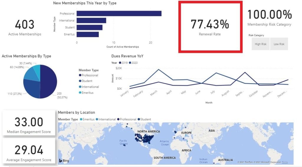
This number is calculated by taking the number of members who renewed and dividing it by the number of members who were eligible to renew.
The renewal rate is a good indicator of member satisfaction. We recommend tracking this number for a couple of months to get a good baseline, and then your association can start using it to guide organization objectives.
Power BI dashboards are dynamic, so if you want to see the renewal rate for a certain member type or for a certain geographical location, you use the other Power BI visuals as slicers.
When we click the ‘Professional’ member type, the renewal rate updates to 88.18%. This is a great way to kickstart an exploratory exercise to figure out why renewal rates for this member type are higher than other member types. Organizations can then take those findings and act on them to drive improvements across other member types.
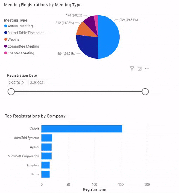
You want to analyze data across tables
When designing your database, it is important to structure it in such a way that discourages data redundancy. What I mean by that is: you want to have a structure that makes it so there is only one source of truth. If a contact changes companies, we should only need to update the new company on the person’s contact record. If that information only “lives” on the contact record, we won’t need to update it on any subsequent records (for example, a committee membership or an event registration record).
However, one limitation of Dynamics visuals is they can only summarize data for one record type at a time. If you want to analyze data across tables, you should opt to leverage Power BI’s ability to do so.
One common requirement we see that would require Power BI is wanting to see which organizations have the greatest number of people registering for meetings.
You can see this is rolled up into a tidy visual on our Power BI Events dashboard.
You can use the slider to analyze this data for a certain date range.
You want to leverage Microsoft’s AI capabilities
Microsoft has made a huge investment in AI technology—Power BI users get to take full advantage of this. These AI capabilities take all the guesswork out of explaining why something is happening. The best part is Power BI comes with AI visuals that can do this analysis in less than 30 seconds.
One of our favorite AI visuals that associations can leverage is the Key Influencers chart. We have used this Power BI visual to show us some of the different factors that influence a member to have an active membership vs. an expired membership.

You can see our active members are more likely to be interested in data analytics and artificial intelligence. Active members are also 1.53x more likely to be members of the Michigan chapter.
Let’s take a look at some of the commonalities among expired members. It looks like members who let their membership expire are not interested in artificial intelligence or data analytics. They are also much more likely to be members of the Florida chapter.
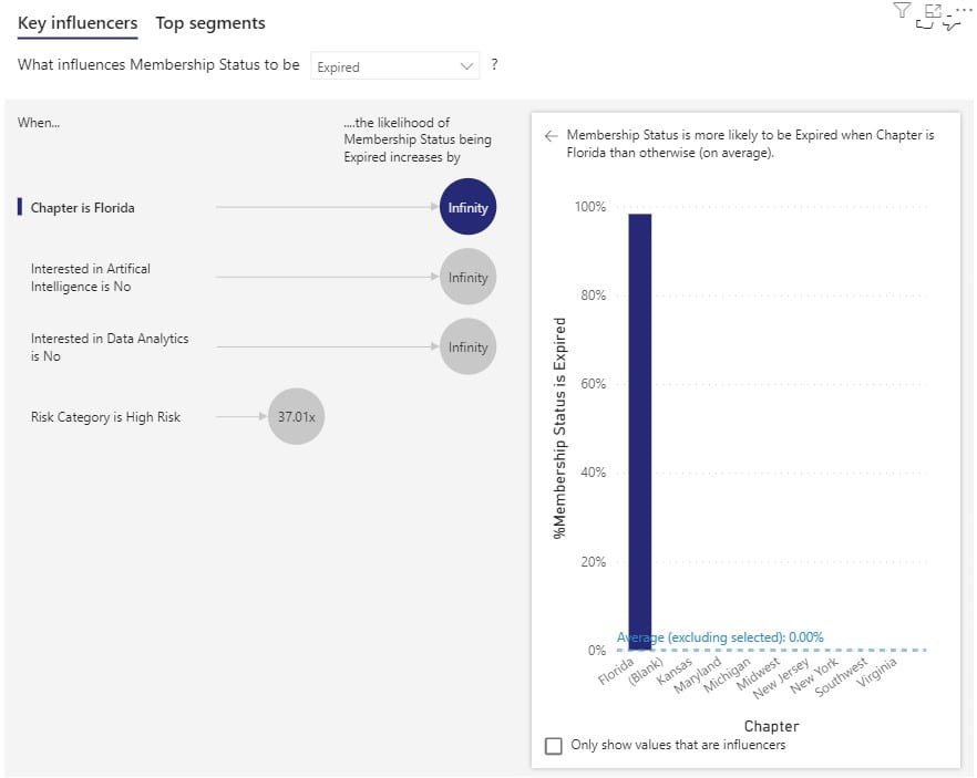
It might be a good idea to reach out to the Florida chapter leadership and figure out why so many members affiliated with this chapter are not renewing their membership. We can use the data from our Power BI report to figure out why certain members aren’t seeing the value of their membership.
You want to see a list of records in your database
As discussed above, dashboards are meant to act as a home base for staff. A dashboard is the first thing a staff member sees when they log into the system.
Because of this, many associations choose to embed a view in a Dynamics dashboard. These views can be used as “to do lists.”
A great example of this is membership applications that need staff approval.
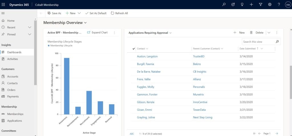
The idea is a staff member logs into the system and sees which records need attention first thing. In this example, the staff member would click into an application on the right and complete whatever manual review the organization has established for submitted applications (verifying employment, checking references, etc). Once that step is complete, the application disappears from the list.
Organizations should embed these lists in a Dynamics 365 dashboard over a Power BI dashboard for two reasons:
- Going into the actual record from a list view in a D365 dashboard is as simple as one-click. In Power BI, clicking into a record from the dashboard is a bit more complicated, requiring extra configuration.
- Power BI refreshes on a scheduled basis. While you can schedule multiple data refreshes each day, the data will not update fast enough to, say, remove a record from the list if you are going through 10 records over the course of 30 minutes.
Want to Know More About Reporting?
By leveraging Microsoft Dynamics and the Power Platform, Cobalt’s solution can provide association leaders with tons of different reporting options. As we discussed in this Power BI vs Dashboards showdown blog, the type of report you use should depend on the scenario. This just shows some of the different reporting options available to our customers. If you are interested in seeing more, let’s connect for a quick introductory call soon.

Connect with a Power Platform Expert
Fewer manual tasks. Powerful business insights. Microsoft license optimizations. Targeted training for your team to use these tools the ways we do every day. Let’s take 15-30 minutes to explore what Cobalt and The Power Platform would do for your team.