
Is this you prepping for every monthly, quarterly, and yearly meeting?
Are you spending too much time going through hundreds of Excel files to identify basic member information? Imagine: a single dashboard that provides a snapshot of your membership, consolidating the answers to those simple-but-important questions that you used to have to calculate yourself. What a dream!
Well, that dream is now a reality with Cobalt’s newest product offerings — a (sweet) suite of Power BI dashboards designed to do the hard work for you.
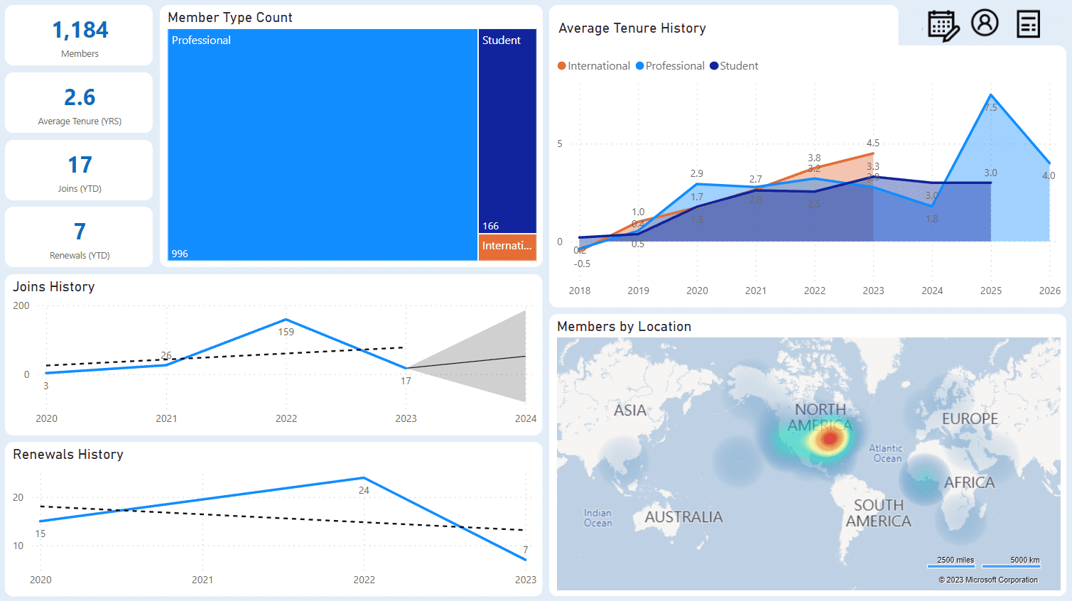
The Membership Snapshot dashboard is a Power BI dashboard that gives you the data you need to do some serious reporting. While we can’t help you do the analyzing, this dashboard is here to give you everything you need to do the hard stuff. You can see membership counts, average tenure, and history – all in one place! And, while we’re into the #nofilter life, this dashboard has multiple filter options for you to get your data looking picture perfect.
Why?
Getting an overview of your membership data shouldn’t have to take more than a click of a button. Power BI dashboards don’t have to take years to implement, and you don’t need extensive training to use them. We’re a big fan of making things easier to use, so you can spend your time on the things that really matter. This dashboard aims to answer questions you and your company may have about the average member, membership activity, and helps you spot trends.
Got Questions?
The dashboard has answers to these questions and more:
- How many total active members does my association have?
- How long do the members typically stay with the association?
- Do we have any trends based on the member type’s average tenure history and does it mean we should change our benefits, programs, marketing to prolong membership tenure for certain member types?
- How many members joined this year?
- How many members renewed this year?
- What are the most popular member types and what are the specific counts of active members per member type?
- Do we have any trends based on the joins history and what should we expect next year?
- Do we have any trends based on the renewal history and what should we expect next year?
- Where are most of our members located and should we hold our next annual conference in this area, or should we target other regions instead to bring awareness?
- Do we have any trends based on gender and should we adjust our benefits and marketing to target any specific groups?
- Do we have any trends based on age and should we adjust our benefits and marketing to target any specific groups?
- Do we have any trends based on education and should we adjust our benefits and marketing to target any specific groups?
How Does it Work?
- Users can add the Membership Snapshot dashboard for an immediate plug-and-play experience. No additional customizations needed, you can start using it right away.
- Staff members can interact with the dashboard and filter using the visuals and additional filters. Now that’s what we call well-rounded.
Want to learn more about this feature? Check out our release notes.