It’s never been easier to say “I do” to Power BI.
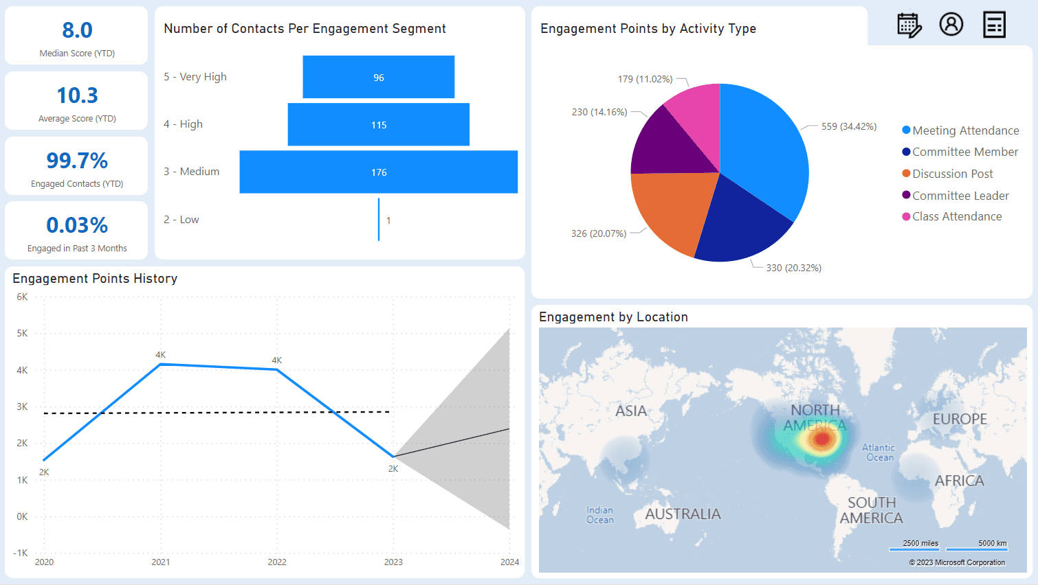
Keeping track of how active your members are can be a time-consuming process. There’s so much to consider, like what is the average level of engagement from members this year? How many people have participated in an activity in the past 3 months? What engagement activities are most popular, and who could benefit from knowing about these activities?
It’s a lot to think about!
Enter the Engagement Snapshot dashboard. The newest offering in our suite of Power BI dashboards, the Engagement Snapshot dashboard is designed to crunch the numbers and give you easy-to-read results, so you can devote your time to big picture analysis. We could all use a little less time staring at a spreadsheets, don’t you think?
Why?
We want to make reporting on your member engagement levels easier. That’s why we made the Engagement Snapshot dashboard in Power BI — so you could easily see how engaged your organization’s contacts are, all in one place. It’s the perfect starting place for some seriously in-depth reporting and analytics about your member engagement.
Got Questions?
The dashboard has answers to these questions and more:
- What is the median engagement this year?
- What is an average engagement this year?
- What percentage of our contacts are engaged?
- How many of these engaged contacts have been engaged in the last three months?
- What is the breakdown of the level of engagement (from very engaged to not engaged)?
- Are there any engagement activity types that are more sought after? Are there any activity types we should stop investing in since members do not find value in these?
- Do the highly engaged contacts participate in specific activity types? How can we advertise it with less engaged contacts?
- Have we seen an increase or decline in engagement over the last few years? Should we change our benefits program?
- Where are our contacts located? Should we plan to have more engagement opportunities closer to where they are?
- Do we have any trends based on gender (more/less interest in certain activity types)?
- Do we have any trends based on age (more/less interest in certain activity types)?
- Do we have any trends based on education (more/less interest in certain activity types)?
How Does it Work?
- Users can add the Engagement Snapshot dashboard for an immediate plug-and-play experience. No additional customizations needed, you can start using it right away.
- Staff members can interact with the dashboard and filter using the visuals and additional filters. You and an interactive dashboard sound like a match made in heaven.
Want to learn more about this feature? Check out our release notes.